Ofer and Hagit, yoga and pilates teachers from Israel, asked me to design their yoga logo.
Hagit and Ofer were both in a yoga instructor course when I met them about 12-13 years ago. In addition to their powerful physical abilities, both also had a total devotion to yoga, as well as outstanding students who became excellent teachers. Yoga is a part of who they are.
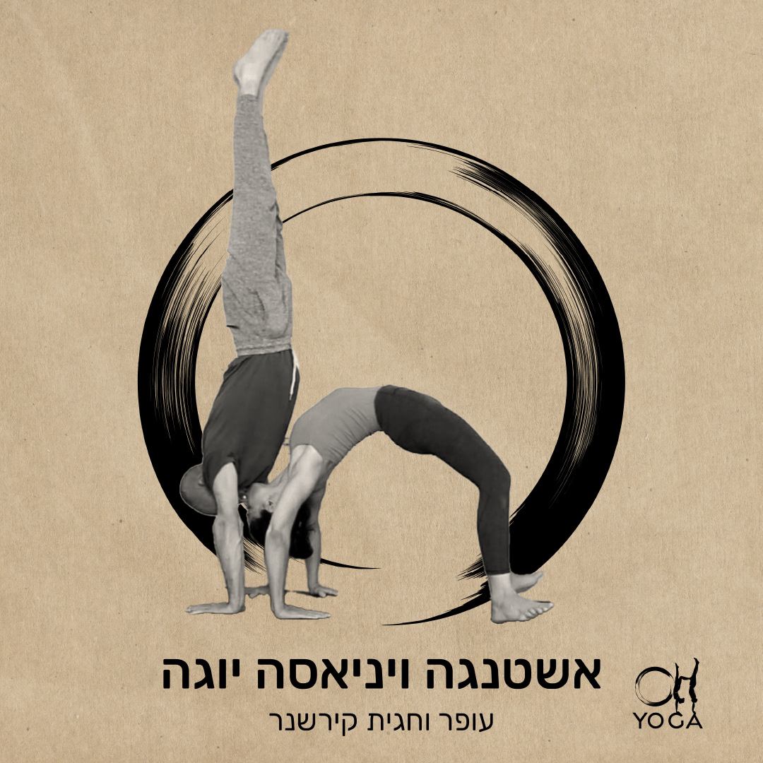
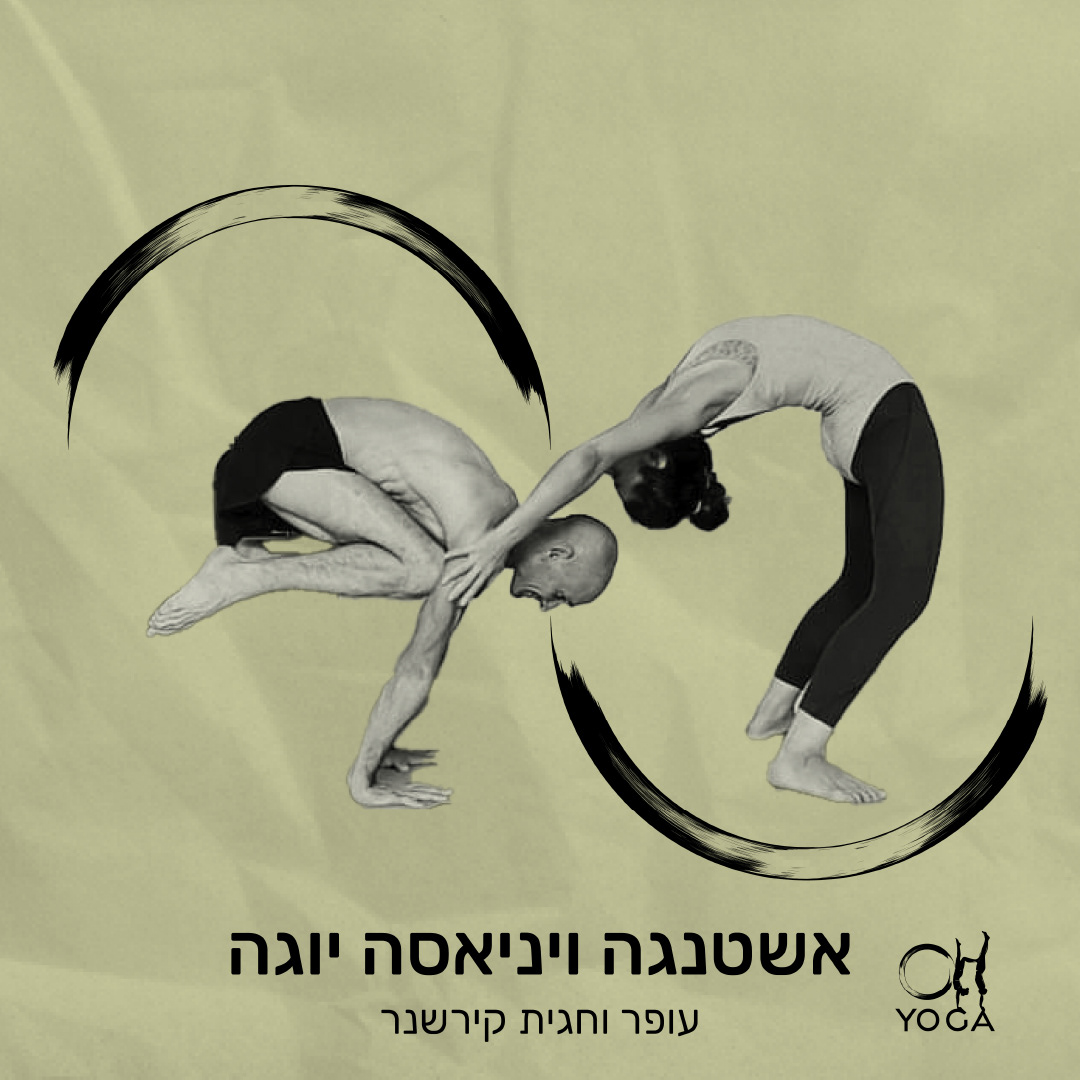
They are represented by the O and H letters as their logo, as their names Ofer and Hagit.
My aim was to find a way in which they themselves could be the logo, the yoga, the representation.
As I searched their pictures, I noticed letters coming out from their couple positions, I saw H and O in the connection between them through yoga. That gave me the idea.
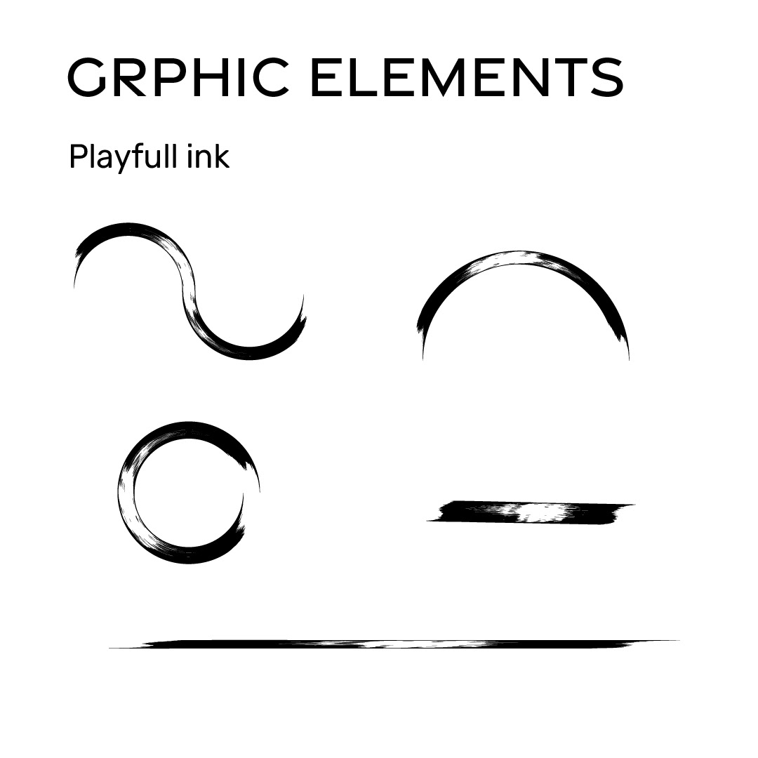
This was the point of start, and from there an interesting dialogue began for accuracy of the logo accompanied by the creation of a graphic language that would accompany it.
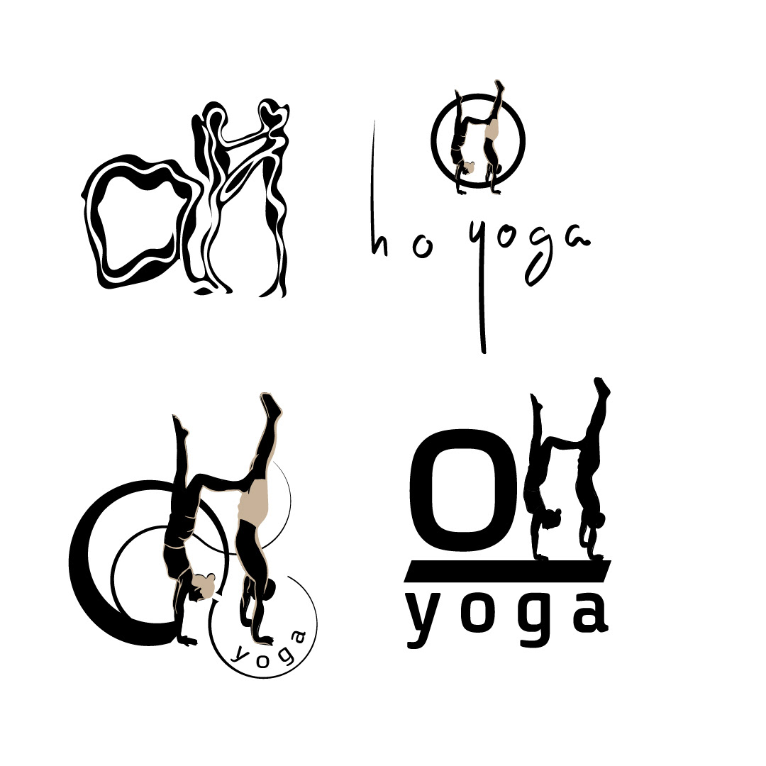
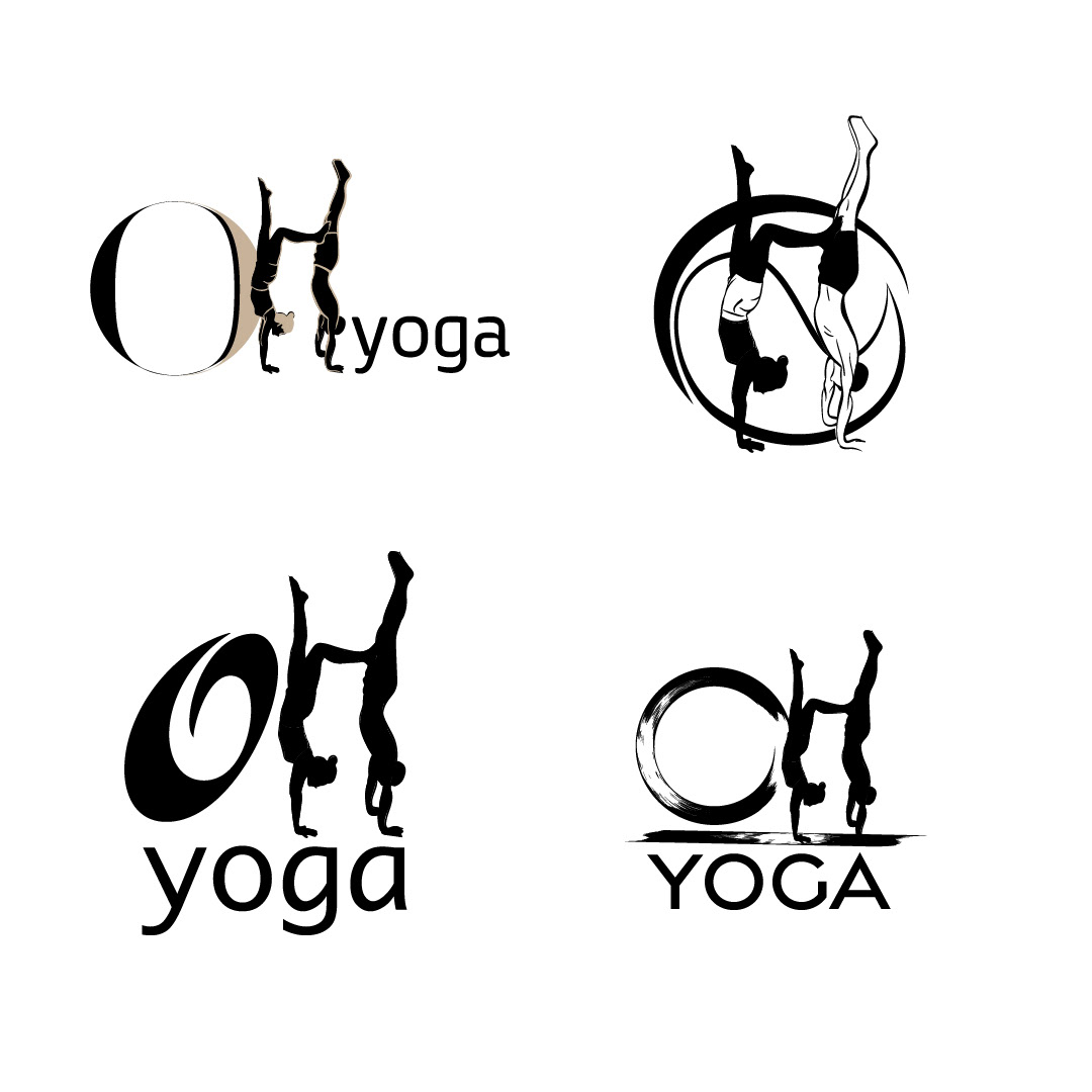
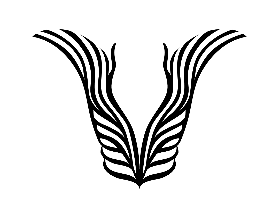
At the end of the process we came to a logo that combines the letters themselves, the O represented by ‘enso’,a zen circle, also known as the ‘circle of enlightenment’. The letter H is actually a silhouette of Ofer and Hagit in a double handstand position.
The logo represents values of balance, integrity, perseverance, way of life, balance, relationship, and basically represents what Ofer Hagit brings to yoga as teachers.



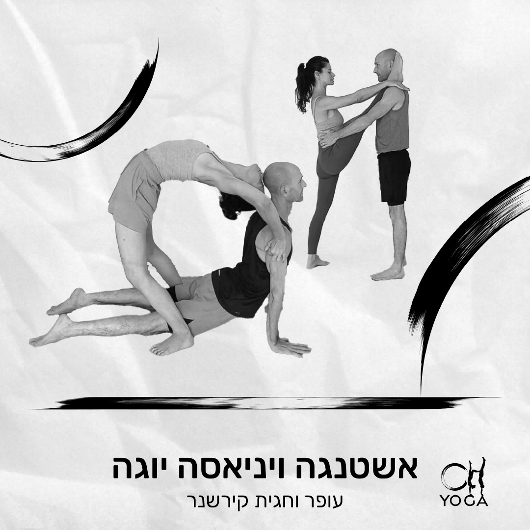
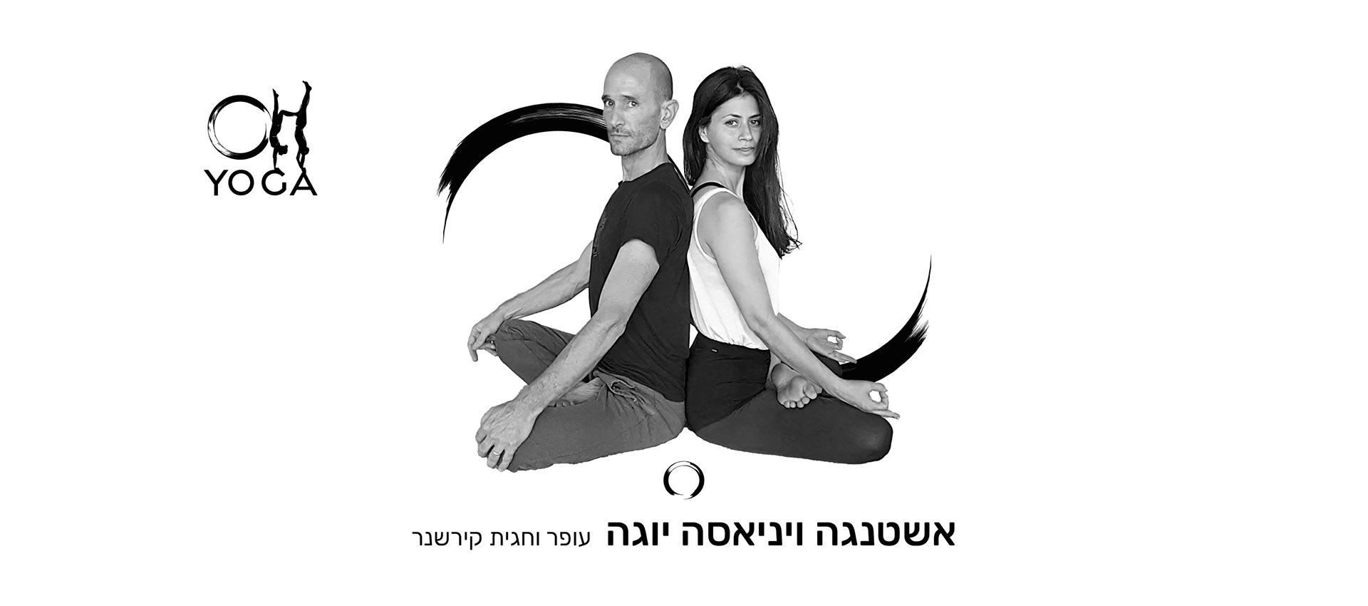
Working with the couple was also very rewarding on the personal level.
Thank you from the bottom of my heart.
Thank you from the bottom of my heart.
From the very first, they expressed enthusiasm for my style and gave me complete trust. Throughout the process I received pleasant and encouraging feedbacks.
The communication was conducted in front of Ofer, but at the end of the process I received a message from Hagit that I am sharing with you here:
"Shira Hi, this is Ofer's wife Hagit.
I just looked at the final product you sent to Ofer - and it is so beautiful. I so appreciate your search with us, for the exact thing, and your creativity and arts. I couldn't imagine anything better. Thank you very much, Shira"
