
Haim Shir, the owner of the Hair Center hair stores, Vitamins company, “hair straightening״ group, a factory for beauty products and more. He is a visionary, entrepreneur, creator and developer of entire lines of products for over 20 years in the field of hair and care products.
After over 20 years in the field, he has decided to create a personal branding system that will connect everything he does.
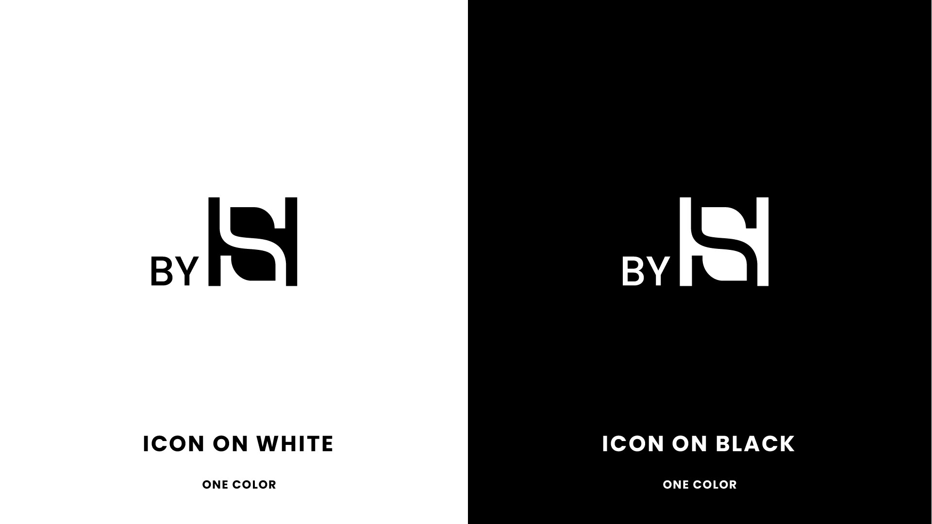
The goal was to create a unique stamp/icon that would be identified with all the businesses he established.
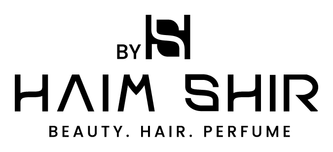
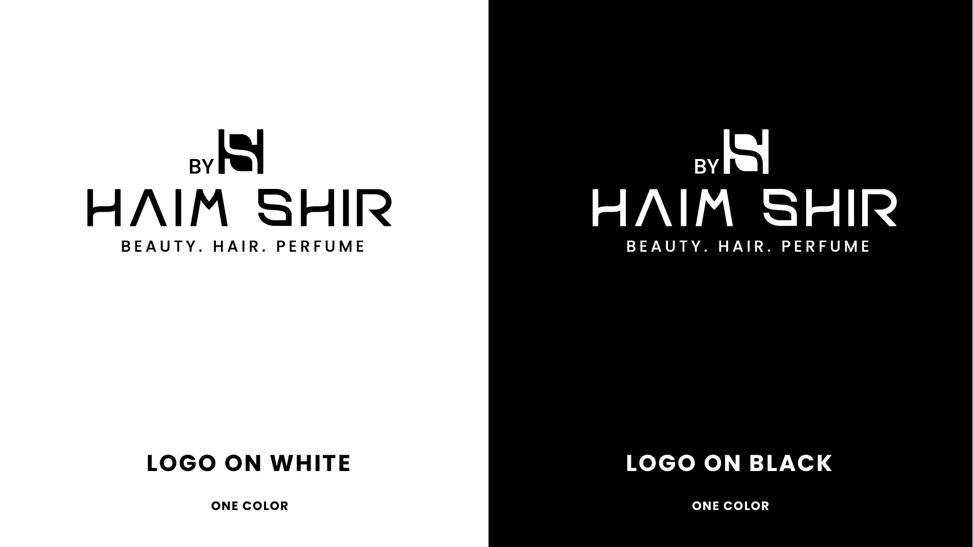
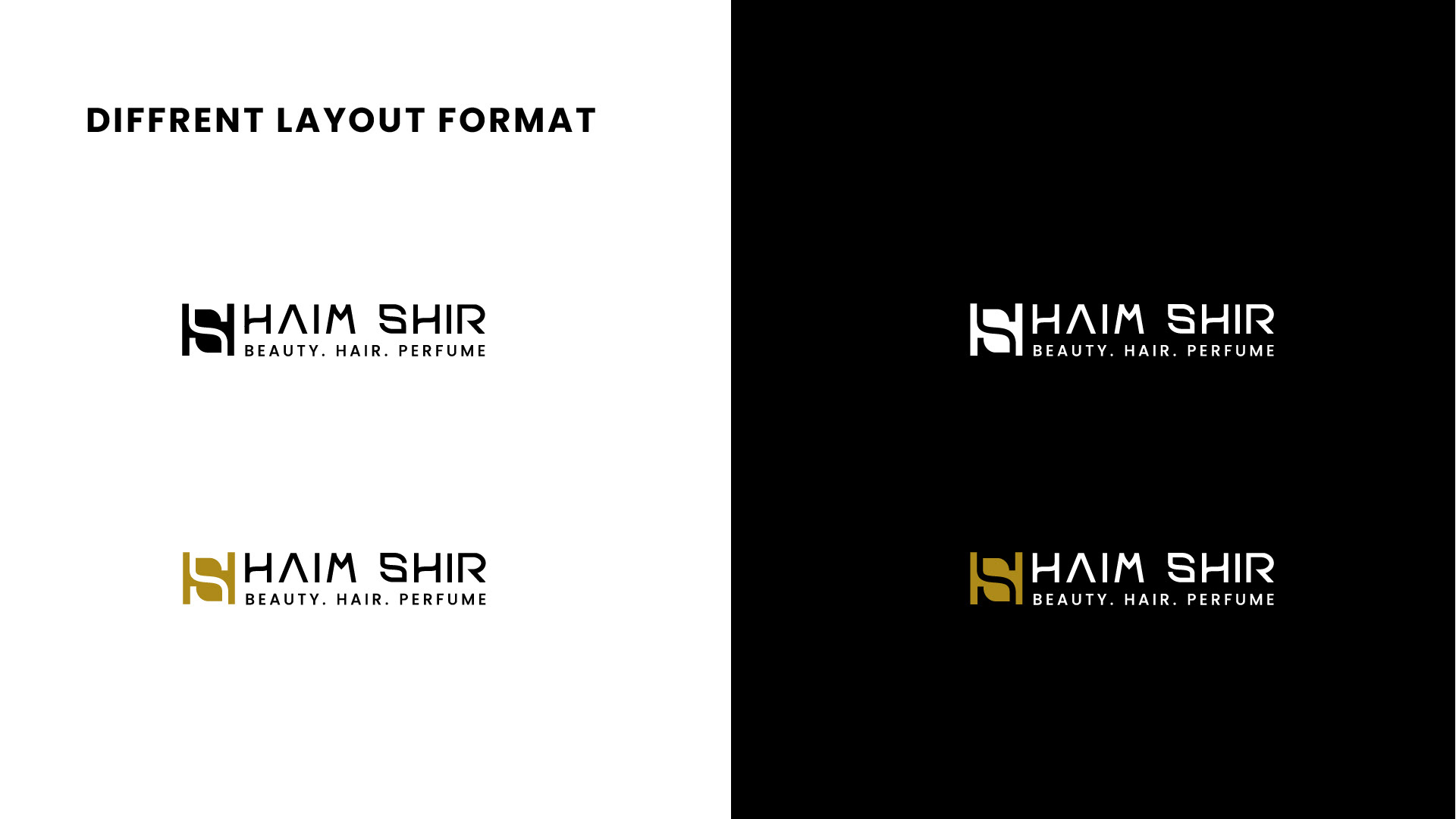
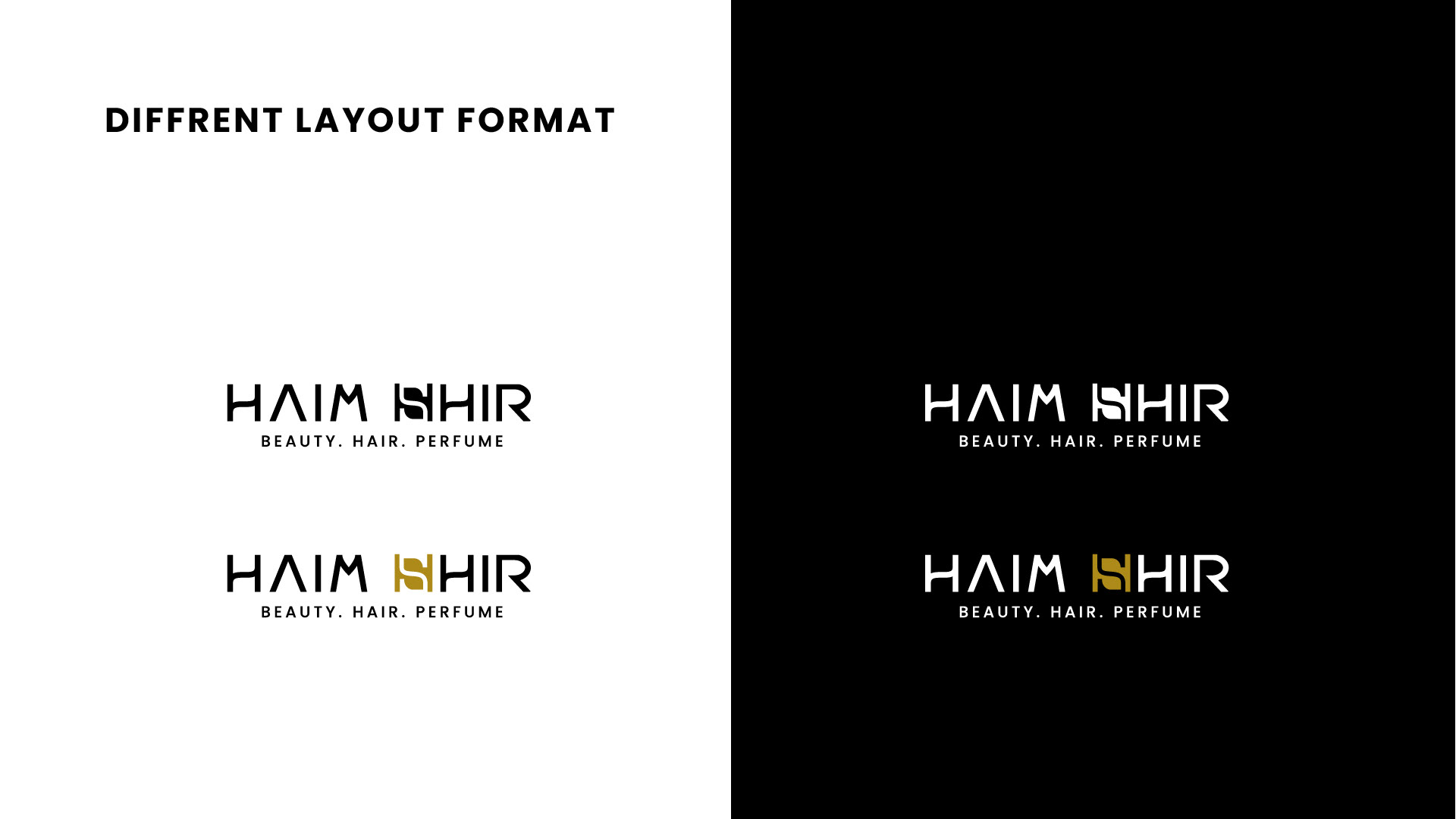
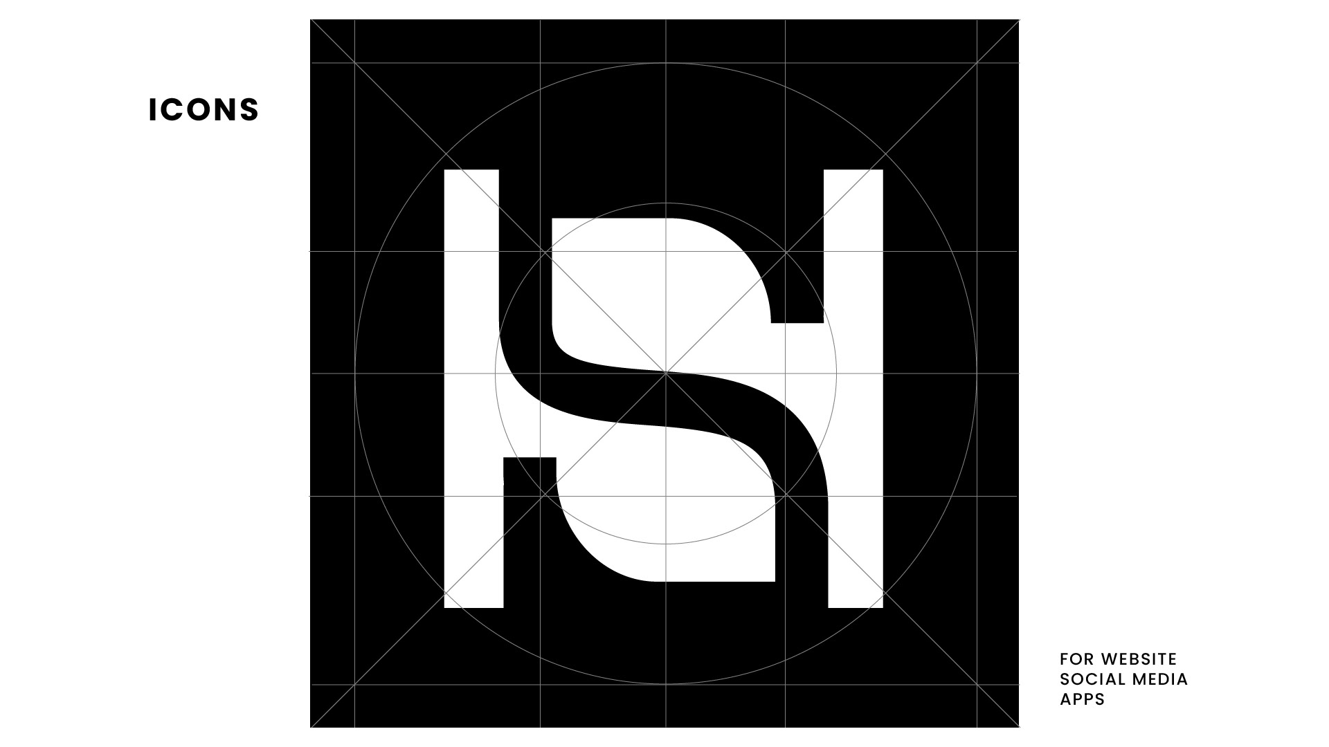
The choice of design was to connect the letters H and S, in a play of shape and space, to the structure of a square symbol.
Typography in the logo is manual and original, built specifically for this logotype.
Flow and movement are the key components of this modern serif typeface. It clearly belongs to the care and beauty category.
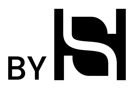
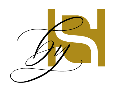
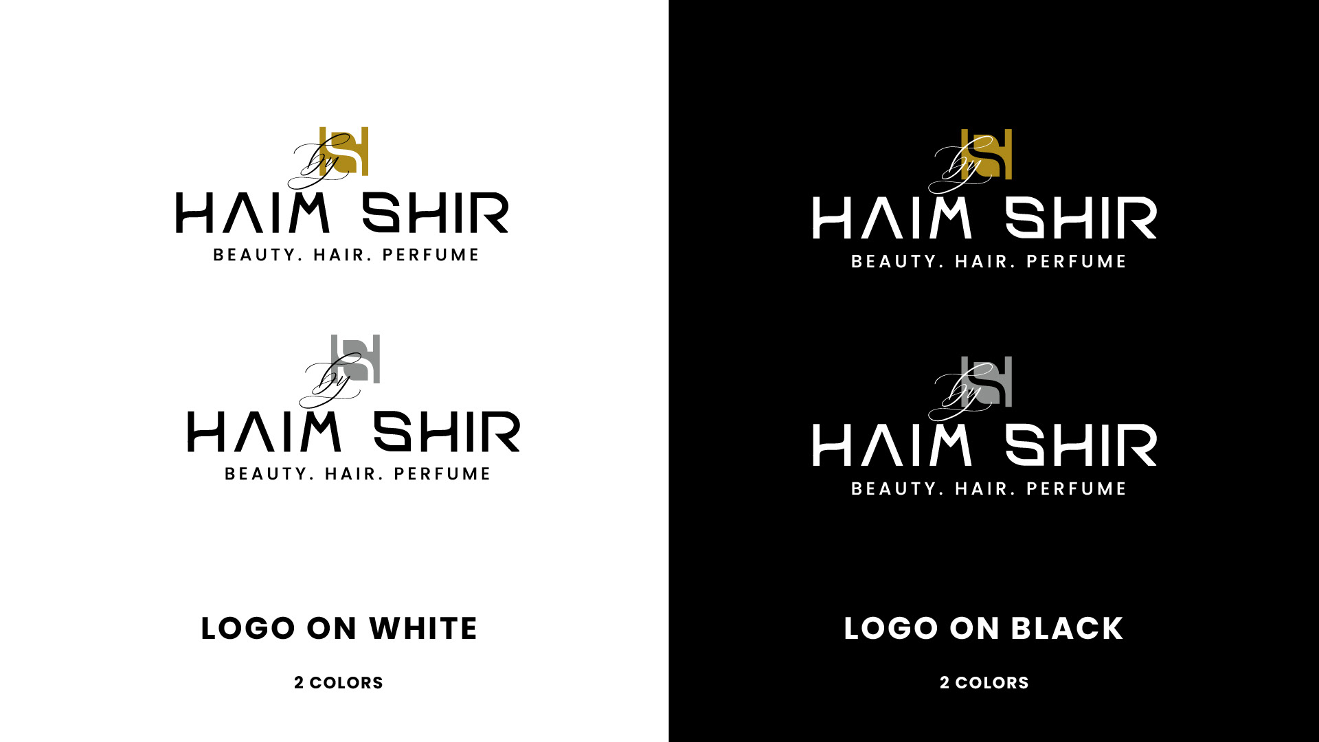
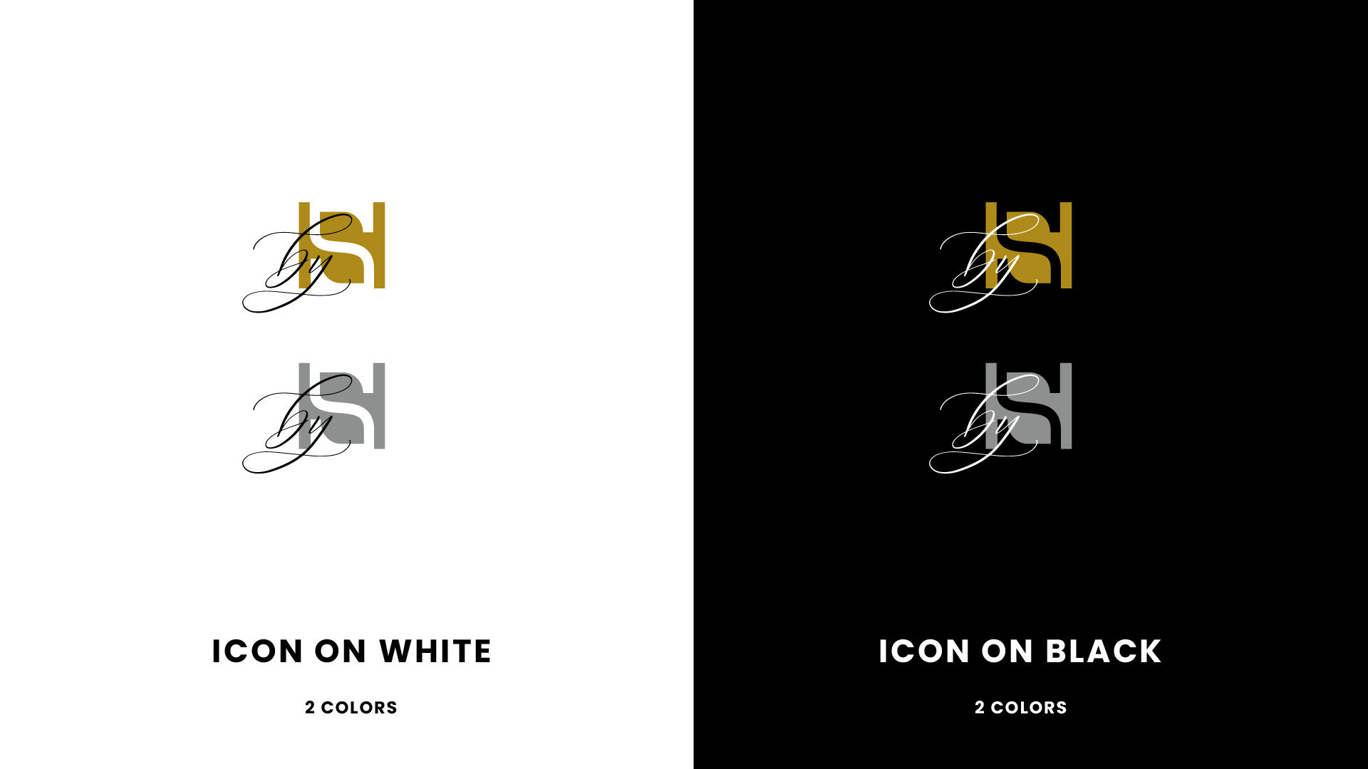
For the icon itself, two variations were chosen that can be used according to the suitability for the product or the environment in which it will be displayed.
The first, clean and classic
The second incorporates handwriting for a more personal and less rigid feel.