The story behind of CRTV logo
This was Creative Software logo for about 20 years.
In 2016 the Creative Software company asked me to renew its logo and the branding of the company.
The remake started from changing the name "Creative Software" to the domain name - CRTV. Its's shorter, easier and leads direct to the website (crtv.co.il) was chosen.
In 2016 the Creative Software company asked me to renew its logo and the branding of the company.
The remake started from changing the name "Creative Software" to the domain name - CRTV. Its's shorter, easier and leads direct to the website (crtv.co.il) was chosen.

After understanding the client needs by deep interview and after market research, I decided to focus on the letters typography what will help to make the name more memorable.
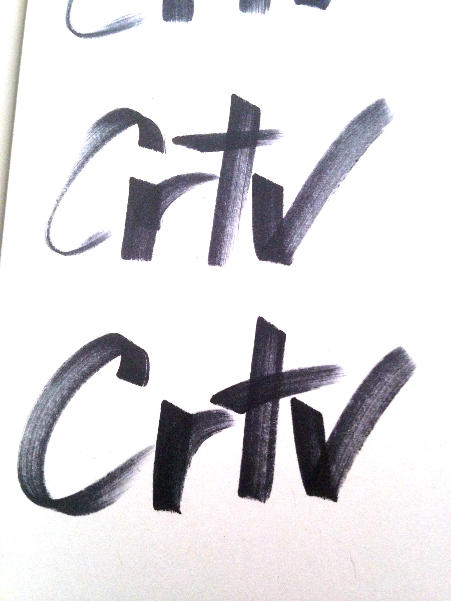
I started to draw the letters, first with a marker on paper, to find up what is hiding there.
I was looking to find personal with high tech touch typography, sort of a signature. Shape that will reflect their holistic solutions with their personal unique service.
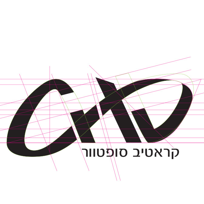
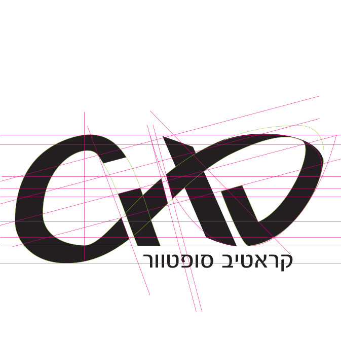
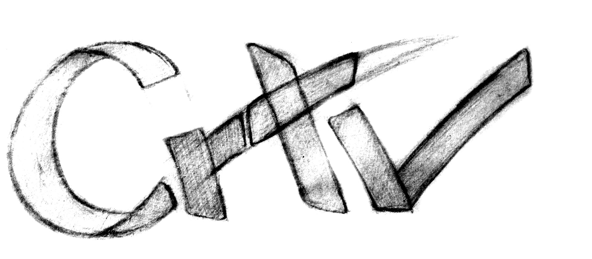
I discover inside the typography the infinity shape, witch gave me the flow I was looking for, the holistic feel, the personal touch, the endless solutions...
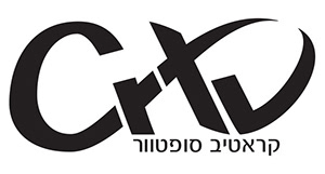
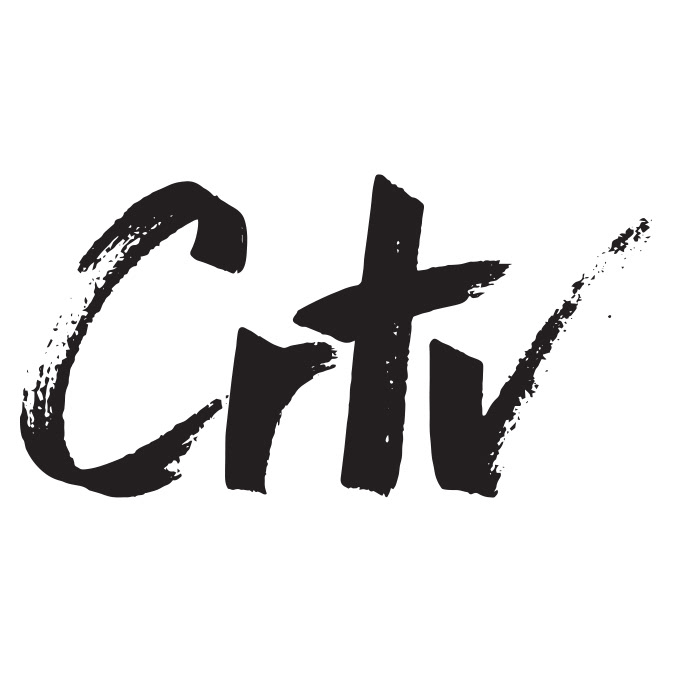
This is the final logo shape
Animated gif for email signature - The infinity element is showed clearly this way.
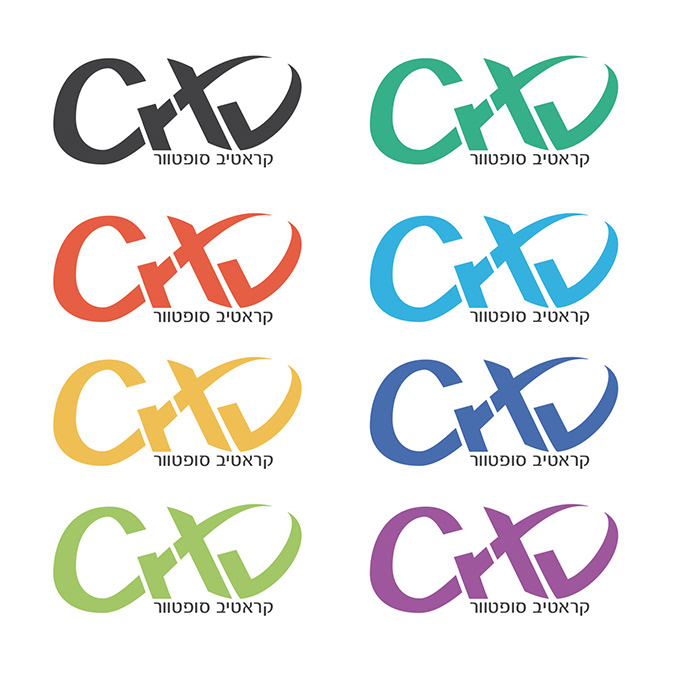
The logo appears in different colors depending on the product it presents.